Here we take a look at all 30 current MLB uniforms and rank them from best to worst, including a few teams that have new looks for 2020.
I’ve always been fascinated by studying sports uniforms, past and present. Uniforms are more than just the clothes that baseball players wear; they’re the team’s statement to the rest of the league and are critical to how each team presents itself. Some teams do it well; others, not so much.
Here we rank the uniforms of all 30 MLB teams, counting down from the worst to the best.

30. Miami Marlins
The Marlins just can’t seem to do uniforms right. Three things wrong with this one: First, they use “Miami” on the home jerseys instead of “Marlins”; second, you can barely make out the logo on the cap, with black on black and a thin outline of the logo; and finally, there’s not nearly enough of the teal and orange that are the team’s secondary colors. Indeed, they could create a unique look if they used those colors more. Instead, these are pretty bland.
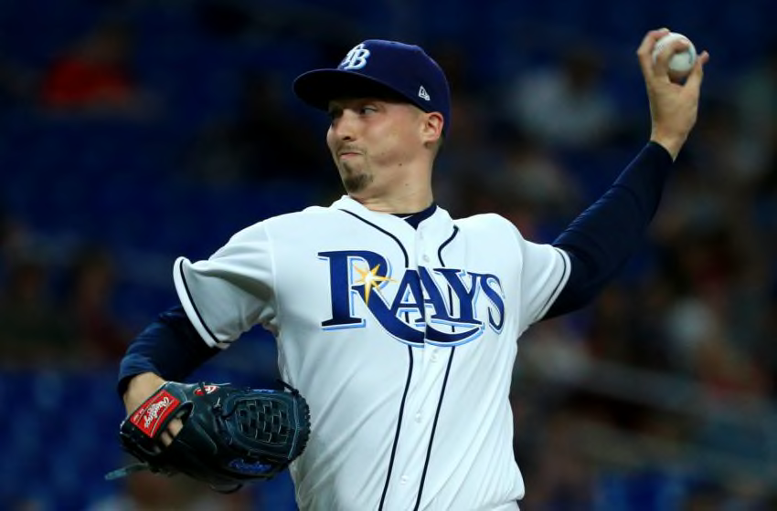
Blake Snell, Tampa Bay Rays, MLB (Photo by Mike Ehrmann/Getty Images)
29. Tampa Bay Rays
Here’s another team from Florida that seems like their uniform set should be more unique than it is. The navy blue colors are boring, as is the font of the lettering on the jersey and the cap. The rainbow lettering from their early days, controversial though it was, was much better; even the green they were doing for several years was better than this.
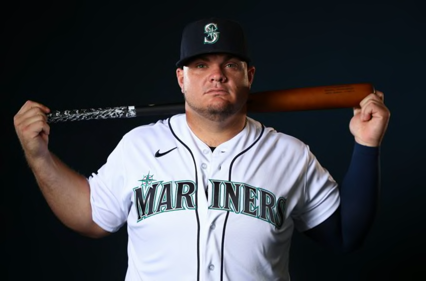
Daniel Vogelbach, Seattle Mariners, MLB (Photo by Jamie Schwaberow/Getty Images)
28. Seattle Mariners
There’s just nothing to get excited about here. The navy blue, again, is dull, and though they have aqua green as a secondary color, it seems out of place outlining the “Mariners” lettering on the jersey. It seems a city like Seattle should be able to do better than this.
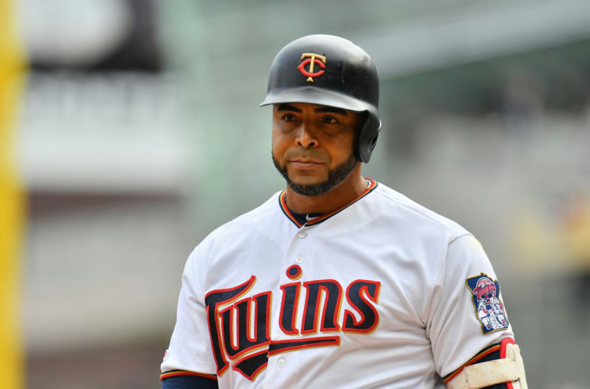
Nelson Cruz, Minnesota Twins, MLB (Photo by Sam Wasson/Getty Images)
27. Minnesota Twins
The red “Twins” lettering with pinstripes they used to have were long overdue for a makeover, but simply changing the lettering to navy blue didn’t do much. In a way, I like how they’ve incorporated the gold in recent years, but on the other hand, it looks like it was forced in there. A full-time switch to the “retro” ones they sometimes use would be welcome.
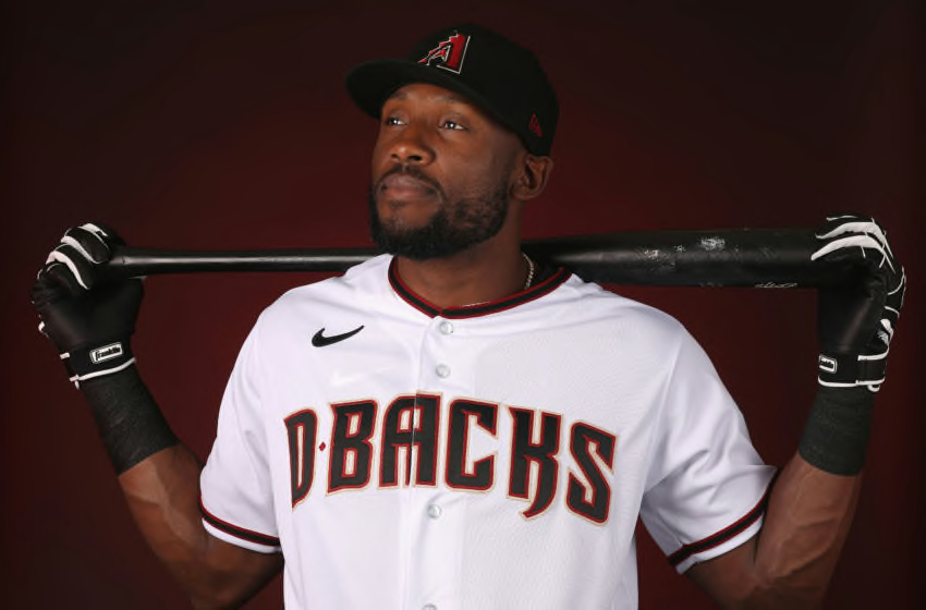
Starling Marte, Arizona Diamondbacks, MLB (Photo by Christian Petersen/Getty Images)
26. Arizona Diamondbacks
Go back to the purple and teal, please! It wasn’t the cleanest look, but it was unique. Black and red is not unique. They’ve tinkered with the lettering a little in recent years and, for now, have landed on this more basic look. There’s just not much character to these. And, I’m sorry, but the whole “D-backs” thing is just way too easy to make fun of.